

Stay Up to Date on the East Bay Market

San Francisco Neighborhood Home Prices

SF Neighborhood Home Prices
We recently issued our semi-annual breakdown of San Francisco home sales by neighborhood, property type and bedroom count.


Note: The surge in expensive, new-condo construction sales in various areas, such as Hayes Valley, Potrero Hill, Inner Mission and the Market Street and Van Ness Avenue corridors, is significantly affecting (raising) the average and median values in those neighborhoods.


These statistics apply only to home sales with at least 1 car parking. Homes without parking typically sell at a significant discount. Below Market Rate (BMR) condos were excluded from the analysis.
As noted on the tables, the average size of homes vary widely by neighborhood. Besides affluence, the era and style of construction often play a large role in these size disparities. Some neighborhoods are well known for having “bonus” bedrooms and baths built without permit (often behind the garage). Such additions can add value, but being unpermitted are not reflected in square footage and $/sq.ft. figures.
If a price is followed by a “k” it references thousands of dollars; if followed by an “m”, it signifies millions of dollars. Sales unreported to MLS are not included in this analysis, and where abnormal “outliers” were identified that significantly distorted the statistics, these were deleted as well. N/A signifies that there wasn’t enough reliable data to generate the statistic.
The Median Sales Price is that price at which half the properties sold for more and half for less. It may be affected by “unusual” events or by changes in inventory and buying trends, as well as by changes in value. The median sale price for an area will often conceal a wide variety of sales prices in the underlying individual sales. Average sales prices may be distorted by one or two sales significantly higher or lower than the normal range. All numbers should be considered approximate.
Dollar per Square Foot is based upon the home’s interior living space and does not include garages, storage, unfinished attics and basements; rooms and apartments built without permit; decks, patios or yards. These figures are typically derived from appraisals or tax records, but can be unreliable, measured in different ways, or unreported altogether: thus consider square footage and $/sq.ft. figures to be very general approximations. Size and $/sq.ft. values were only calculated on listings that provided square footage figures. All things being equal, a house will have a higher dollar per square foot than a condo (because of land value), a condo’s will be higher than a TIC (quality of title), and a TIC’s higher than a multi-unit building’s (quality of use). All things being equal, a smaller home will have a higher $/sq.ft. than a larger one.
Many aspects of value cannot be adequately reflected in general statistics: curb appeal, age, condition, views, amenities, outdoor space, “bonus” rooms, parking, quality of location within the neighborhood, and so forth. Thus, how these statistics apply to any particular home is unknown without a specific comparative market analysis. Data is from sources deemed reliable, but may contain errors and is subject to revision.
These links below can be used to access other real estate reports and articles.

Seasonality and the SF Real Estate Market

Seasonality & the SF Real Estate Market


In August we completed an analysis of how seasonality affects inventory, buyer demand and median sales prices. These 2 charts illustrate its effect on listings accepting offers and prices. Please note that other factors besides changes in values can affect median price fluctuations. For the complete report: Seasonality & Real Estate

San Francisco Home Sales by Property Type and Price Range

San Francisco Home Sales by Property Type & Price Range


Unlike the vast majority of other counties, condos and condo-like homes such as co-ops and TICs now predominate in the SF homes market, a trend that will only accelerate as dozens of (expensive) new-condo projects come on line in coming years. The difference in median sales prices between houses and condos has also narrowed to less than 12% - when condos used to be the significantly cheaper alternative. Condos also play a huge role in luxury home sales, often selling for the highest dollar per square foot figures in the city. TIC sales, almost an exclusively SF phenomenon, have been dwindling, but now sometimes command prices in excess of $1,500,000.
The relatively small quantity - and declining percentage of sales - of house listings in San Francisco has put significant competitive pressure on house prices. This effect has been cascading through the city's neighborhoods, from most desirable to historically less desirable, as families search for affordable options in a rapidly appreciating market. Very, very few new houses are being built in the city and those that are, are typically very costly.

Autumn Selling Season Begins

Autumn Selling Season Begins & New Listings Surge in San Francisco
Coming out of the summer slowdown, the last big sales season of the year runs from early September to mid-November (when the market usually retreats into semi-hibernation until mid-January). September is typically the single month with the highest number of new listings and this year, it started out with a bang: 300 new listings hit the market in the first week after Labor Day. As a point of comparison, May, the biggest new-listing month YTD, had a total of 720.
A list of San Francisco's most recent listings can be found here, easily sortable by neighborhood, property type and price: New Home Listings
This year's summer slowdown was bigger than usual: Compared to 2013, the number of listings coming on market dropped 12% and the number of sales fell 16% - these are large drops. Median sales prices also declined significantly from the spring peak, but summer price drops are normal due to seasonal factors. We've found it difficult and risky to make confident assessments of market trends during the summer or winter holiday slowdowns: One really has to see what happens in spring and autumn when sellers and buyers jump back in.

This chart compares Months Supply of Inventory (MSI) – a measurement of buyer demand against the supply of homes for sale; median Days on Market (DOM) – how quickly new listings go into contract; and median home sales prices, for the city, state and country. Typically, an MSI under 3 to 4 months is considered a seller’s market; at an average of 1.5 months of inventory over the summer, San Francisco would typically be considered an extreme seller’s market (which puts upward pressure on prices). San Francisco’s median days-on-market figure is also extraordinarily low, and of course, our home prices are significantly higher than most places on the planet.
Not shown on the chart, but another dramatic indicator of market conditions: Over the last 3 months the average SF home sale closed for 7% over the original asking price. (It hit 10% in May at the height of the spring frenzy.)
What Should I Offer?
https://www.youtube.com/watch?v=JzzR2XEWv-A You've found a home you really like and you're ready to take the next step but what should you offer?
I've put together a few things I think are important to consider as you prepare your offer.

Sales Prices Over and Under List Price

Sales Prices Over & Under List Price
Believe it or not, this next chart, which shows an incredible percentage of San Francisco home sales selling for more, and often much more, than asking price, actually indicates a small cooling from May’s market. In May, 7% of homes sold went through price reductions before sale; in July, price reductions went up to 11%. In May, the percentage of homes selling for 20% or more over list price was 29%; in July, that dropped to 24%. In May, 8% sold more than 1% under list price; in July, it was 12%. Most of July’s sales went into contract in June and if the market is cooling further, which is not unusual in mid-summer, it won’t show up in the statistics until later.


Biggest Home Sales of 2014 (So Far...) by Neighborhood

Biggest Home Sales of 2014 YTD, by Neighborhood
These two charts of the most expensive house and condo sales so far this year are not comprehensive, but simply snapshots of highest home prices achieved in a selection of neighborhoods around the city. One can't help loving the idea that the biggest SF home sale reported to MLS so far in 2014, at $11 million, was marketed as having "tremendous potential."


Mortgage Interest Rates

Mortgage Interest Rates
Interest rates, whose movements are famously difficult to predict, have for the time being remained very low – an important dynamic in the real estate market as people compare the costs of renting and buying.


Shifts in the San Francisco Luxury Home Market

Shifts in the San Francisco Luxury Home Market
20 years ago, “San Francisco luxury home” referred to real estate in the northern band of old-prestige neighborhoods running from Sea Cliff/ Lake Street/ Jordan Park through the Pacific Heights/ Marina district, to Russian, Nob & Telegraph Hills (plus a few smaller enclaves like St. Francis Wood and Ashbury Heights). Those neighborhoods are still known for large, beautiful, expensive homes and, indeed, still dominate the ultra high-end. But other districts have developed footprints in the luxury market due to changing tastes and demographics, to the high-tech boom creating new centers of gravity for wealth (and changing commuting patterns), and to the formation of entirely new SF neighborhoods.
The general Noe, Eureka and Cole Valleys district (much of which was originally blue-collar neighborhoods) is now one of the most sought after areas of the city, and its prices have blown through the roof – more houses over $2 million now sell here than in all the prestige northern neighborhoods combined. In the South Beach, Yerba Buena and Mission Bay area, some of the most expensive condo buildings in the country have risen from formerly B-class commercial-industrial wastelands. And most recently, new $1000+ per square foot condo buildings are beginning to pop up in places like the Mission, Hayes Valley and the Market Street corridor, catering to new, young, high-tech buyers.
These two charts show the shifts that have occurred just in the past 7 years.


Where to Buy a Home Under $1 Million

Buying a Home for under $1 Million
There has been a lot of chatter in the media recently about the median home price in San Francisco hitting $1,000,000. Here’s a look at the neighborhoods where one is most likely to find something under that price.
If one wishes to buy a house for less than a million dollars, choices are definitely shrinking with the recent, huge surge of appreciation – approximately 50% over the past 2.5 years. Neighborhoods like Bernal Heights, Miraloma Park and the Richmond district are quickly dropping off the list of options. The largest selection of affordable houses is now in the neighborhoods running along the western and southern borders of the city.


2 Tips for Home Buyers Today
https://www.youtube.com/watch?v=XKav8JrB110 It's a tough market out there for buyers, but there can be great opportunities if you know what to look for. I've put a few tips together to help buyers in today's market.

Luxury Homes in Review

San Francisco Luxury Home Sales & PricesContinue to Climb Past Previous Peaks
July 2014 Update with 8 Custom Charts and Tables
The luxury segment of San Francisco’s real estate market was the last to peak, in 2008, while most other housing segments started to lose steam in 2006-2007. After the financial markets crash in September 2008, the city’s high-end home market generally lost the least value on a percentage basis, 15-20%, as compared to the 20-60% drops seen elsewhere. Then it was the first to recover in late 2011/early 2012. Now, SF luxury home values have accelerated well past the previous peak values of 6 years ago. The factors include the increasing strength of the Bay Area economy; the huge, local surge in high-tech and affiliated wealth; an increase in well-heeled foreign buyers; and the fact that the highly affluent have, by far, profited most from the recent, tremendous appreciation in stocks and other financial assets.
The net result: There is an enormous amount of new and old money sloshing around the Bay Area looking for homes to buy. Luxury homes in San Francisco are typically defined as condos, co-ops and TICs selling for $1,500,000 and above, and houses selling for $2,000,000 or more. These are relatively arbitrary thresholds since $2,000,000 might buy a small-ish, fixer-upper house in Pacific Heights or a large, gracious home in another neighborhood. It is also true that the significant appreciation since 2011 has simply moved more sales into the “luxury” price category, which at current trends will soon require reassessment.
Adjusting your screen-view to zoom 125% or 150% will make the charts that much easier to read. A San Francisco neighborhood map can be found at the bottom of this report.


San Francisco High-End Home Sales by Neighborhood
Luxury house sales in San Francisco are dominated by the swath of established, prestige, northern neighborhoods running from Sea Cliff and Lake Street through Pacific & Presidio Heights and Cow Hollow; by the greater Noe-Eureka-Cole Valleys district (which has seen explosive growth in this market segment since the mid-nineties); and, to a lesser extent, the smaller neighborhoods around St. Francis Wood and Forest Hill.
High-end condo sales have now overtaken luxury house sales in the city because of all the new-condo construction which occurred over the past 10-15 years – and this building frenzy, which lapsed in the 4 years after the market crash, is accelerating once again. (Very few new houses are built in SF anymore, though the ones that are built, are typically quite expensive.) Besides the older Pacific Heights-Marina and Russian & Nob Hills districts, and the greater Noe-Eureka Valleys district, the newer neighborhoods of South Beach, Yerba Buena and Mission Bay have a rapidly growing footprint in luxury condo sales. And just very recently, high-priced, high-tech, condo buildings are being constructed in areas such as the Mission, Hayes Valley, and the Market Street and Van Ness corridors that were not previously considered luxury-home locations.


Sales Price to Original List Price Percentage & Average Days on Market
For the sake of simplicity, this chart looks at all SF home sales of $2,000,000 and above in the 2nd quarter of 2014. The 88% of these listings that sold without price reductions averaged a sales price 9% over asking price, with a very low average days-on-market of 26 days. These statistics are an indication of a very high-demand market. But not every home sold quickly: Listings that were price reduced averaged a sales price 12% below original price and spent 2.5 months longer on the market. And then 35 listings expired without selling, typically due to being perceived as overpriced. Even in a red hot market, one can overprice one's home - and doing so will severely impact the market response.

Here one can see the effect of new, high-rise buildings such as the Four Seasons, the Millennium and the Infinity Towers, all located in the greater South Beach-Yerba Buena area, on the high-end condo market in the city. However, note that this list ranks only the largest condo buildings and since many of the condos in the older neighborhoods are in much smaller buildings, they won't show up here even though they have extremely high values as well. Besides location, premium services and expensive amenities, probably the most common element of luxury condos in San Francisco is spectacular views, which can add hundreds of thousands or even millions of dollars to the sales price. (The city's most expensive condo sale ever - a penthouse at the St. Regis - closed for $28m in 2011.)

This table includes neighborhoods of varying home values, but still gives a fair representation of high-end home-price trends over the past 20 years. Average sales prices and dollar per square foot values have blown past their previous peaks of 2007-2008.


For your convenience, below is a map of San Francisco neighborhoods and a breakdown of neighborhoods in each Realtor district.

District 1 (Northwest): Sea Cliff, Lake Street, Richmond (Inner, Central, Outer), Jordan Park/Laurel Heights, Lone Mountain
District 2 (West): Sunset & Parkside (Inner, Central, Outer), Golden Gate Heights
District 3 (Southwest): Lake Shore, Lakeside, Merced Manor, Merced Heights, Ingleside, Ingleside Heights, Oceanview
District 4 (Central SW): St. Francis Wood, Forest Hill, West Portal, Forest Knolls, Diamond Heights, Midtown Terrace, Miraloma Park, Sunnyside, Balboa Terrace, Ingleside Terrace, Mt. Davidson Manor, Sherwood Forest, Monterey Heights, Westwood Highlands
District 5 (Central): Noe Valley, Eureka Valley/Dolores Heights (Castro, Liberty Hill), Cole Valley, Glen Park, Corona Heights, Clarendon Heights, Ashbury Heights, Buena Vista Park, Haight Ashbury, Duboce Triangle, Twin Peaks, Mission Dolores, Parnassus Heights
District 6 (Central North): Hayes Valley, North of Panhandle (NOPA), Alamo Square, Western Addition, Anza Vista, Lower Pacific Heights
District 7 (North): Pacific Heights, Presidio Heights, Cow Hollow, Marina
District 8 (Northeast): Russian Hill, Nob Hill, Telegraph Hill, North Beach, Financial District, North Waterfront, Downtown, Van Ness/ Civic Center, Tenderloin
District 9 (East): SoMa, South Beach, Mission Bay, Potrero Hill, Dogpatch, Bernal Heights, Inner Mission, Yerba Buena
District 10 (Southeast): Bayview, Bayview Heights, Excelsior, Portola, Visitacion Valley, Silver Terrace, Mission Terrace, Crocker Amazon, Outer Mission
Some Realtor districts contain neighborhoods that are relatively homogeneous in general home values, such as districts 5 and 7, and others contain neighborhoods of wildly different values, such as district 8 which, for example, includes both Russian Hill and the Tenderloin.

10 Factors Behind the SF Real Estate Market

Supply, Demand, Money and Demographics
10 Factors Behind San Francisco’s Real Estate Market
July 2014
This chart is a simplified, smoothed-out and approximate look at the last few real estate cycles in San Francisco, illustrating estimated percentage changes in home prices from successive peaks and bottoms of the market. The years between these high/low points are simply depicted here as straight lines (which does not reflect reality). Different market segments have experienced varying appreciation and depreciation rates over the years and how this chart applies to any specific property is unknown without a tailored analysis.

- Population growth: San Francisco has recently been adding approximately 10,000 new residents per year and new home construction has not come close to adding enough additional housing units to meet increase demand. (And more would move here if they could find a place to live.) New construction is booming again in the city, but it will be a while before enough new units arrive (to rent or to buy) to substantially change the existing high-demand/low-supply dynamic.
- Employment growth: San Francisco now has the highest number of employed residents in its history and job numbers continue to grow as new companies start up and existing ones expand. Many of these new jobs are very well paid.
- Surging stock market: The S&P 500 is up over 50% since 2011 began. The affluent have benefited most from the recent, large increase in the value of financial assets, and San Francisco has one of the most affluent populations in the country. When people feel wealthier, they spend more on homes, second homes and real estate investment properties.
- Brand new wealth: Thousands of newly affluent residents – including significant numbers of millionaires and even billionaires – have been created in the Bay Area in recent years from stock options, IPOs and company sales. This is super-charging the “wealth effect” on the market.
- High rents: Purchasing a home in San Francisco, with the attendant tax benefits and equity accrual (as well as the possibility of future appreciation), often makes compelling financial sense if the alternative is to pay an extraordinarily high rent.
- Low interest rates: from 1996 to 2006, the average interest rate on a 30-year fixed rate loan was approximately 6.3%. As of early July 2014, it was 4.1%. That 35% reduction in the cost of financing makes an enormous difference in affordability and the ongoing cost of housing.
- Renting instead of selling: High rents and low interest rates have convinced some owners who would have sold their homes to rent them out instead. The Airbnb rent-to-tourists option is probably adding to this. This further depresses the supply of new listings coming on market, exacerbating the inventory shortage: 2013 to 2014 for the 1st half, the number of new MLS listings is down 7.5%, when higher prices would typically be expected to increase it. (If considering this option, see Renting vs. Selling in San Francisco.)
- Work there, live here: A relatively recent development, many of the people working or taking new jobs in Silicon Valley high-tech and bio-tech now insist on living in the city. The “Google bus” phenomenon is just one illustration of a trend which puts considerable additional pressure on our housing market.
- Magnet effect: San Francisco, a small city of 7 by 7 miles, is now the capital of perhaps the fastest growing, most lucrative, highest-prestige business segment. It is also in one of the most beautiful, best educated, most tolerant and culturally rich metropolitan areas in the world. That makes the city a magnet for smart, creative, ambitious people from all over the planet and they are willing to pay a premium to live here.
- Limited supply: Almost two thirds of the city’s housing is in rental units, much of it under rent control. The number of homes suitable for owner-occupancy and available to purchase each year is relatively small: As an example, the SF homes market is less than half the size of the markets in either Alameda or Contra Costa counties.
San Francisco’s real estate market is now about 2 ½ years into its latest recovery. In the last few cycles, recoveries have typically lasted 5 to 7 years before a significant market adjustment, but, of course, the past is no guarantee of the future.

Prices Cycles and Trends in SF Real Estate

Prices Cycles and Trends in SF Real Estate
Of Seasons, Factors, Prices, Cycles & Trends in San Francisco Real Estate
July 2014 Mid-Year Market Report by Paragon Real Estate Group
After perhaps the most frenzied market since the gold rush this past spring, in this mid-year report, we’ll step back and look at the San Francisco homes market from a variety of angles. The market typically slows during the summer months due to vacations, family stuff and buyers being exhausted by the spring market. None of which necessarily means that summer might not be a good time to act, since whether buying or selling, one’s competition lessens during these months before the market picks up again in mid-September.


Sales Prices above List Prices
The large majority of SF home sales this past spring sold quickly, without price reductions and for over asking price. This chart breaks down, by neighborhood, the average percentage over list price those homes sold for: Historically speaking, these are astounding percentages. This statistic will also be affected if large numbers of agents adopt a strategy of underpricing their listings to artificially boost demand. Note that the South Beach-Yerba Buena-Mission Bay district has by far the most listings and sales in the city, and that relative abundance of inventory affects this statistic.


Median Prices by Neighborhood
Comparative values for 3-4 bedroom houses and 2-bedroom condos with parking.


-------------------------------------------------------------------
San Francisco Luxury Home Market
This last spring saw the highest volume of SF luxury home sales in history. We just updated our report on this market segment, which was featured on KGO Radio and the front page of the Chronicle’s business section. Below are 2 charts, but the full report can be found here: Luxury Home Report
-------------------------------------------------------------------
Average Dollar per Square Foot
Comparative dollar per square foot values by neighborhood and property type.

-------------------------------------------------------------------
District Home Sales by Price Range
These are 2 of 14 charts in a full analysis of San Francisco home sales by price range, property type and neighborhood, which gives an idea of the actual sales behind overall median sales prices. The full report is here: District Sales Breakdowns


-------------------------------------------------------------------
Months Supply of Inventory, Average Days on Market & Inventory-Level Trends
Several standard statistical measures of market strength have hit historically low points in the past few months. (Low points = extremely high demand coupled with extremely low supply, which is the classic cause of rising prices.)


-------------------------------------------------------------------
Trends in Home Sales by Property Type
Comparing the percentage make-up of San Francisco home sales – house, condo, co-op, TIC and multi-unit properties – between 2008 and 2014: condo sales are way up due to extensive new construction over the past 10-15 years, house sales (as a percentage of total sales) are somewhat down as very few new houses are built in the city, and TIC sales are way down due to political and financing issues.

For your convenience, below is a map of San Francisco neighborhoods and a breakdown of neighborhoods in each Realtor district.
District 1 (Northwest): Sea Cliff, Lake Street, Richmond (Inner, Central, Outer), Jordan Park/Laurel Heights, Lone Mountain
District 2 (West): Sunset & Parkside (Inner, Central, Outer), Golden Gate Heights
District 3 (Southwest): Lake Shore, Lakeside, Merced Manor, Merced Heights, Ingleside, Ingleside Heights, Oceanview
District 4 (Central SW): St. Francis Wood, Forest Hill, West Portal, Forest Knolls, Diamond Heights, Midtown Terrace, Miraloma Park, Sunnyside, Balboa Terrace, Ingleside Terrace, Mt. Davidson Manor, Sherwood Forest, Monterey Heights, Westwood Highlands
District 5 (Central): Noe Valley, Eureka Valley/Dolores Heights (Castro, Liberty Hill), Cole Valley, Glen Park, Corona Heights, Clarendon Heights, Ashbury Heights, Buena Vista Park, Haight Ashbury, Duboce Triangle, Twin Peaks, Mission Dolores, Parnassus Heights
District 6 (Central North): Hayes Valley, North of Panhandle (NOPA), Alamo Square, Western Addition, Anza Vista, Lower Pacific Heights
District 7 (North): Pacific Heights, Presidio Heights, Cow Hollow, Marina
District 8 (Northeast): Russian Hill, Nob Hill, Telegraph Hill, North Beach, Financial District, North Waterfront, Downtown, Van Ness/ Civic Center, Tenderloin
District 9 (East): SoMa, South Beach, Mission Bay, Potrero Hill, Dogpatch, Bernal Heights, Inner Mission, Yerba Buena
District 10 (Southeast): Bayview, Bayview Heights, Excelsior, Portola, Visitacion Valley, Silver Terrace, Mission Terrace, Crocker Amazon, Outer Mission
Some Realtor districts contain neighborhoods that are relatively homogeneous in general home values, such as districts 5 and 7, and others contain neighborhoods of wildly different values, such as district 8 which, for example, includes both Russian Hill and the Tenderloin.


Home Sales by District and Price

Home Sales by San Francisco District and Price
These charts show the breakdown of San Francisco home sales as reported to the city’s Multiple Listing Service in 2014 by 6/25/14. These analyses are sorted by city districts and neighborhoods by the number of transactions in different sales-price segments. Some of the districts contain neighborhoods and homes of widely varying values.
Whether you are considering a home purchase within a certain price range or contemplating the sale of your property in a certain neighborhood, this may give you a sense of what sells for how much where in San Francisco. The first chart is an overview for the entire city.
If you adjust your view to Zoom 125%, the charts will be that much easier to read.


These 3 charts below track San Francisco luxury home sales by price range and neighborhood in 2013. Rather arbitrarily, we designate the luxury segment as those condos, co-ops and TICs selling for $1,500,00 or more, and those houses selling for $2,000,000 and above.


San Francisco Demographics by Zip Code

San Francisco Demographics by Zip Code
A statistical breakdown by household income, education, homeownership, foreign-born population, household size, age and other criteria.
June 2014 Report
The below charts and table are based upon U.S. Census surveys from 2010 – 2013. Please note that zip codes often contain neighborhoods of widely different demographics. For example, 94115 includes Pacific Heights, one of the most affluent areas of the city, as well the Western Addition, which is much less affluent. A number of SF zip codes are like this and when mixing very different neighborhoods together, you often end up with statistics that don’t really apply to any of them. Zip codes are relatively blunt instruments for demographic investigation, but we still found the analysis to generate interesting, new insights into San Francisco, our ever-changing city.
Each chart illustrates the data for 10 to 12 SF zip codes. Below the charts is a complete table of all the data collected.
The neighborhoods associated with zip codes in the charts and table below are simply representative labels; other neighborhoods are contained within each zip code and many are divided between two or more zip codes.

Foreign-Born Percentage of Population
Of major metro areas, San Francisco ranks 4th in the country in percentage of foreign-born residents. In three of the city’s zip codes, foreign-born residents constitute a small majority.

Residents with Bachelor’s, Graduate & Professional Degrees
San Francisco ranks 2nd in the country for percentage of residents with bachelor’s degrees and ranks 3rd for percentage of residents with graduate or professional degrees. Not surprisingly, when looking at zip codes, educational attainment and household income typically go hand in hand.

Percentage of Housing Units Owner-Occupied
San Francisco has approximately 70% more housing units occupied by renters than by homeowners. By zip code, homeownership percentages in the city range from 0% (100% renters) to over 80%.

Average Size of Household
San Francisco has the lowest percentage of children of any major U.S. city and 38% of residents live alone. This brings the city’s average household size down, however the statistic varies widely by zip code, ranging from 1.6 to 3.6 residents per household.

Median Age of Residents
The youngest zip codes in San Francisco are those that are 100% rental: the Presidio and Treasure Island. The oldest zip code is the area of the North Waterfront and Barbary Coast, just north of the financial district along the Embarcadero. Second oldest is Chinatown (47 years) and the third oldest is the St. Francis Wood-Miraloma Park area.

Below are 1) a map of San Francisco home values by neighborhood (not zip code, since MLS data allows us to get more specific), 2) a table with all the SF zip code demographic data we collected, and 3) a basic map of city zip codes for easy reference. They will be easier to read if you adjust your screen-view to zoom 125% or 150%.
* Move your mouse over the map to select specific neighborhood home-value icons *

Median sales prices and dollar per square foot values may be affected by number of diverse factors, and how they apply to any particular property is unknown without a specific comparative market analysis.
Zip Code Demographics Data Table
Zip codes in the table below are in order of median household income.


30 Years of SF Real Estate

Real Estate Cycles in San Francisco for the past 30 Years

Over the past 30+ years, the period between a recovery beginning and a major “market adjustment” (or bubble popping) has run 5 to 7 years. We are currently about 2.5 years into the current recovery.
Periods of market recession/doldrums following the popping of a bubble have typically lasted about 4 years. (The 2001 dotcom bubble and 9-11 crisis drop being the exception.) Generally speaking, within about 2 years of a new recovery commencing, previous peak values (i.e. those at the height of the previous bubble) are re-attained – among other reasons, there is the recapture of inflation during the doldrums years and simple pent-up demand.
Our complete article on market cycles can be found here.
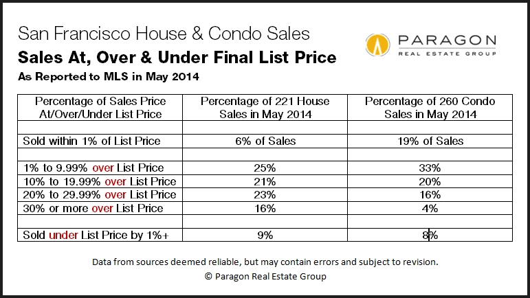
Over Asking Price between Houses and Condo
Over Asking Price Comparison between Houses and Condos
The table below shows how over/under/at asking prices have broken down between houses and condos recently.

New Construction is Transforming San Francisco

New Construction Is Transforming San Francisco
The construction boom that ended in 2008 changed the city and its housing market. Condos now outsell houses in San Francisco. The South Beach-Yerba Buena zip code, previously a commercial area filled with parking lots, now has SF’s highest median household income. Mission Bay was born. And our skyline has been altered with dramatic, new high-rises like the Infinity Towers and Millennium.
That boom died with the 2008 market crash. But now with the city’s economy, employment, population, rents and home prices all surging to new heights, new home construction is booming again.
Will increasing numbers of newly built condos and apartments cool our overheated real estate market? One would think it would have to – eventually. But the large projects announced weekly can take years to turn into actual housing units. What if local high-tech industry, jobs and housing demand continue to grow alongside increasing supply? And our financial and real estate markets are influenced by so many complex, fluctuating economic, political and even natural-event factors, that it is very difficult to make meaningful predictions (despite how much “experts” love to make them).
One thing we can predict: San Francisco will continue to change in unexpected ways, and it will remain an extraordinary place to call home.
 Much of the city’s new construction is occurring on parcels that were previously commercial-industrial, often on busy urban streets and/or in relatively neglected sections of the city – places that not so long ago might have been considered subprime locations for residential development. That has flipped 180 degrees: Wherever they are, most of these new projects are selling for prices rarely, if ever, seen before in their respective neighborhoods and bringing in new populations of typically young, affluent buyers. For good or ill, or both, depending on how you feel about this phenomenon, these developments are altering the cultures, demographics, commercial districts and home values of the neighborhoods they’re sprouting up in.
Perhaps the biggest common denominators of these properties are dramatic architecture, full service amenities (doormen and such), and the prevalence of spectacular views from many of the units. Eight of these properties didn’t even exist before 2000 and now they dominate the list of most expensive condo buildings in the city. Of course, excluding smaller buildings with only a sale or two per year rules out the vast majority of condo buildings in older neighborhoods, but it’s still astounding to see the impact of the previous construction boom on this market segment.
Even though the newer South Beach-Yerba Buena district dominates the list of most expensive condo buildings, older-prestige neighborhoods such as Pacific Heights and Russian Hill still have more luxury condo sales – for the time being. Though there is the odd high-rise, they’re typically in smaller, older (though beautiful) buildings, with a completely different architectural feel from the developments of the last 10 – 20 years.

The first golden age of SF apartment buildings – some of which were turned into condos and many of which remain rent-controlled apartments – was from 1920 to 1940: The units in these buildings are large, light, gracious and filled with elegant detail. Pacific Heights, the Marina, Russian Hill and Lake Street are filled with these buildings. Though there are beautiful apartments built in other eras (Edwardian flats, Art Deco apartments), the second golden age really arrived with the latest burst of new-condo construction since 2000: These units are ultra-modern and feature highest quality finishes and amenities. They are exemplified by the luxury, full-service high-rises of the South Beach-Yerba Buena area, though variations on this theme, in non-high-rise form, have been springing up all over the city. As seen in this chart, they command a premium in dollar per square foot value.

A residential district that didn’t even exist 20 years ago now dominates condo sales in San Francisco (and there are big, new projects still under development there). To a large degree due to the availability of large, developable (previously commercial) lots and higher-density zoning, new housing construction is now concentrated in areas such as the Market Street and Van Ness corridors, SoMa, the Mission, Hayes Valley, Dogpatch and Hunter’s Point – and often in previously neglected or distressed corners of such areas.
Income, Age, Homeownership & Foreign-Born Population by Zip Code
We recently completed a study of San Francisco's changing demographics by zip code and this is one of 7 charts and tables assessing income, age, education and other issues. This report has recently been featured in many local media outlets such as the Chronicle’s website, SFGate.com (where it became the most popular article of the day). We found it to be fascinating information and the full analysis can be accessed via this link: San Francisco Demographics Report

A glance at the last 20 years of San Francisco median home prices for houses, condos and TICs: Our recovery since 2012 has made up all the lost ground from the 2008 crash, and then some. Note that median prices are often affected by other factors besides changes in existing home values – new-construction condos hitting the market in large quantities, for example – and should be considered as generalities only. Still, the overall trend lines do illuminate the recent cycles in the city’s housing market. TICs are a relatively small portion of the market and their huge 2014 YTD surge should be taken in context: Just deleting 8 extremely expensive sales at 1100 Sacramento on Nob Hill drops the TIC median price by almost $50,000.


This report has focused on market-rate condo construction, but a more complete analysis that includes affordable, rental and social project housing construction can be found here:New Housing Construction in San Francisco